Data Visualisation in R

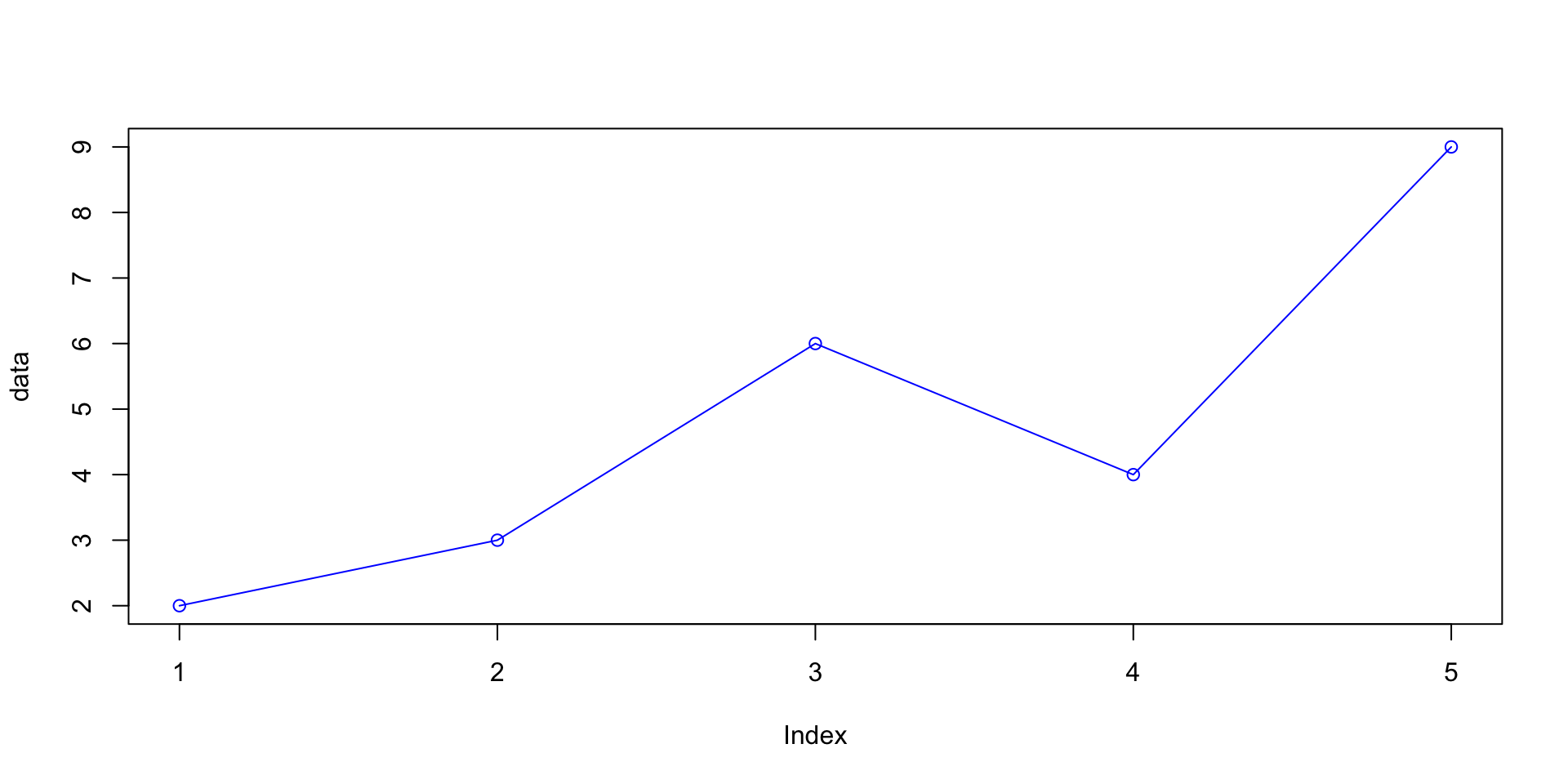
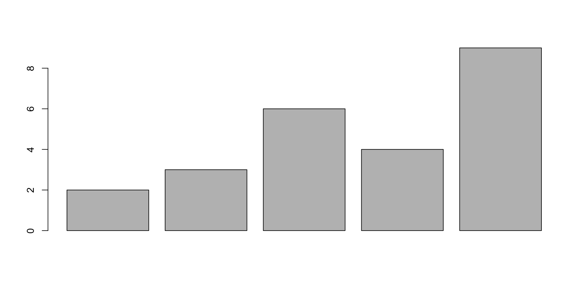
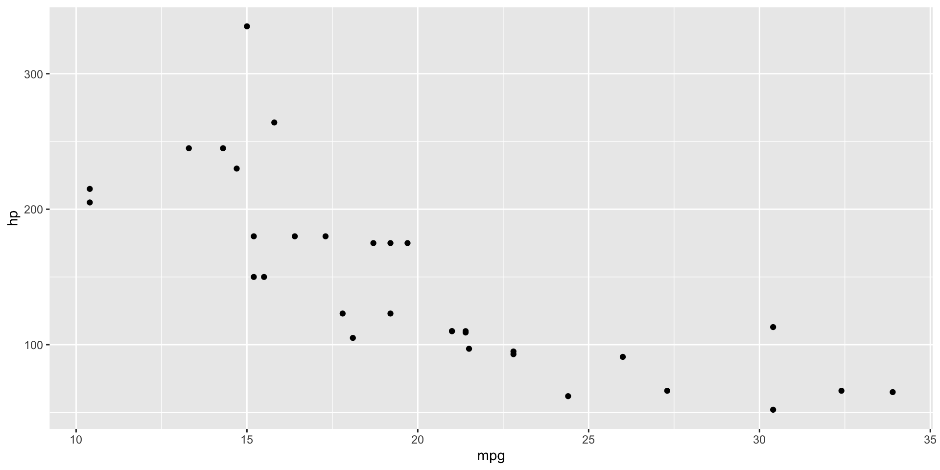
Base R plots
- Graphs can be easily generated with the base R syntax
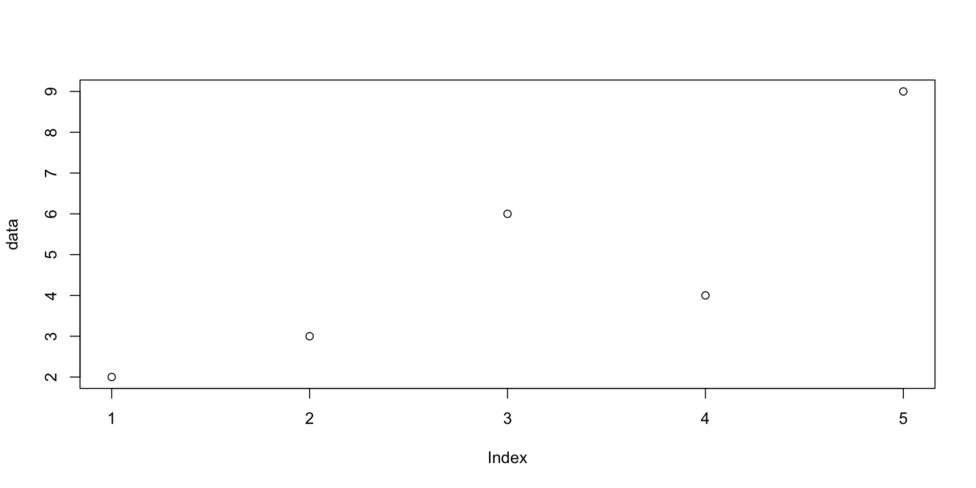
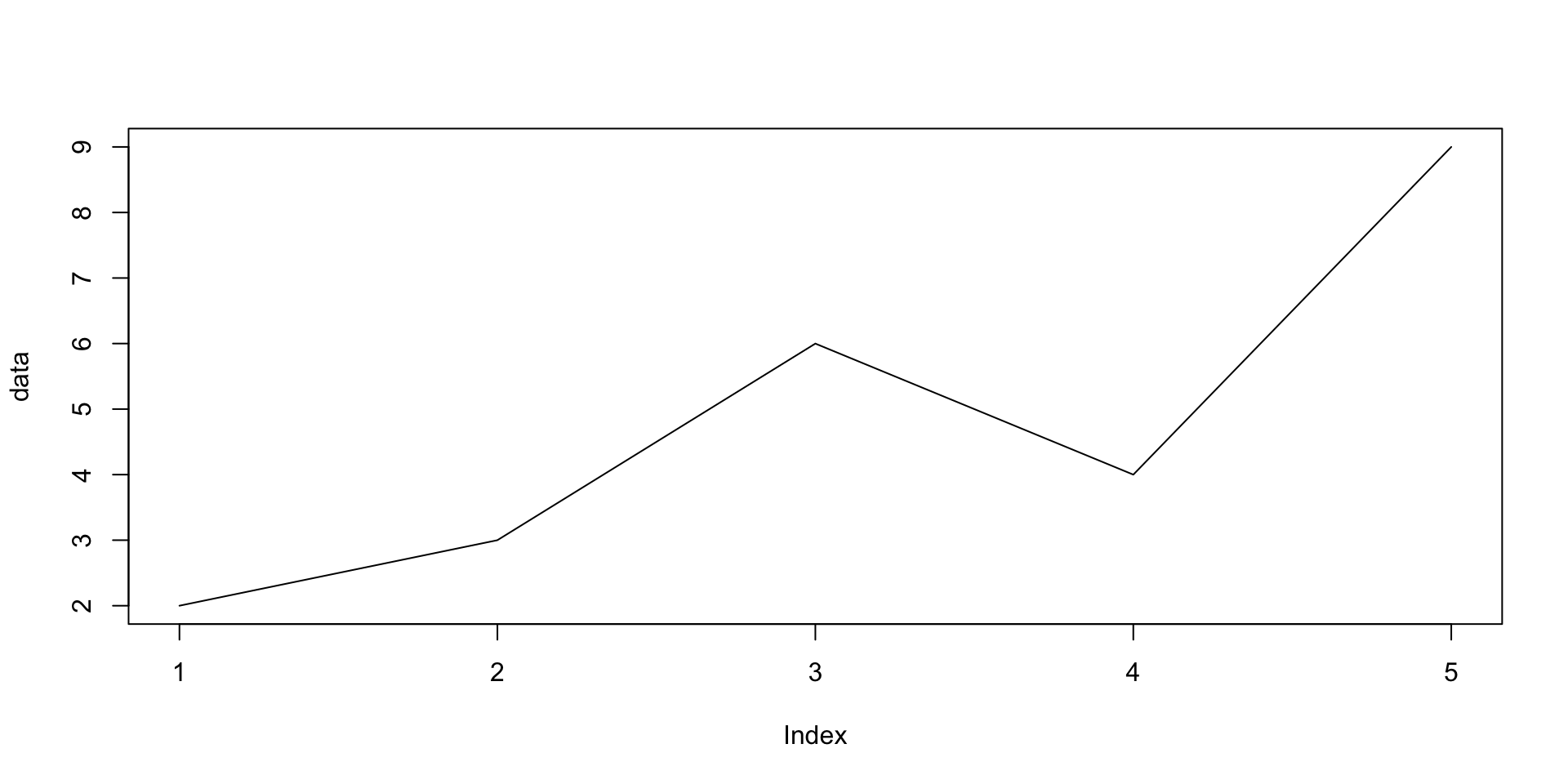
Base R plots
- Graphs can be easily generated with the base R syntax
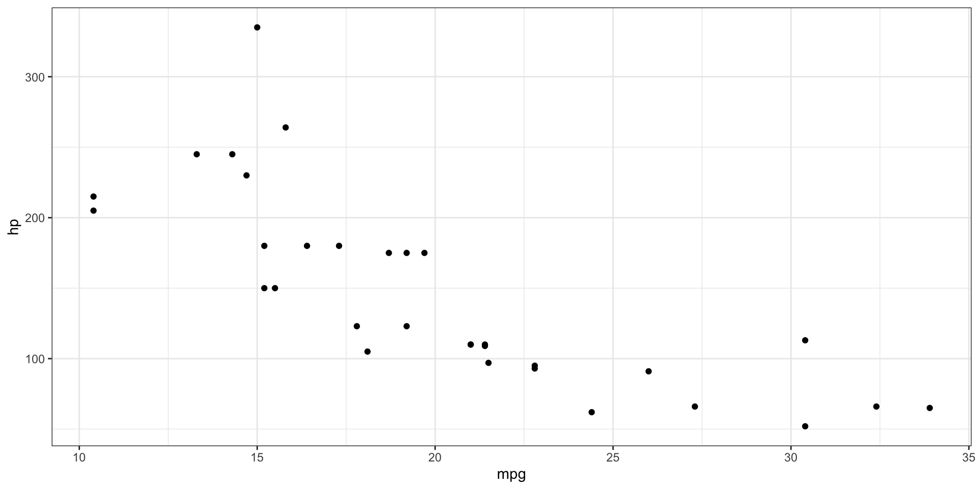
ggplot2
ggplot2is a lot more useful and user friendly than base R, making plots look a lot nicer and with more options for building and displaying graphics- We’ll start with an old favourite, the
mtcarsdataset!
Themes
- A “theme” controls the finer points of the plot, like the font size and background colour
- This is essentially customising the non-data elements
- For example, change the default grey background to white background1
Themes - Global
- These themes can be set globally, so for all plots, using the
theme_set()function

- You can see some more themes provided by ggplot2 here
Quick plots with qplot
- A quicker version of ggplot! Good for very basic figures

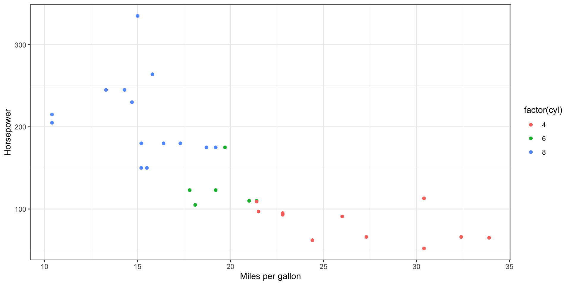
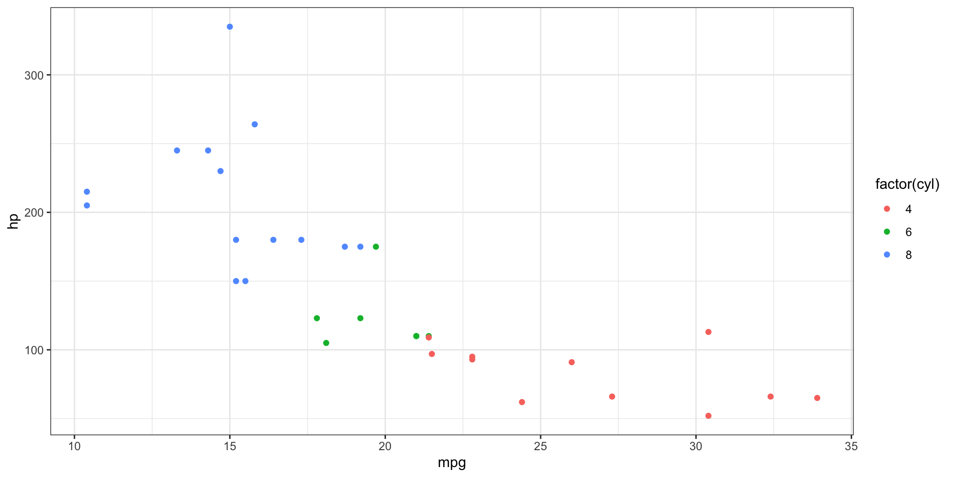
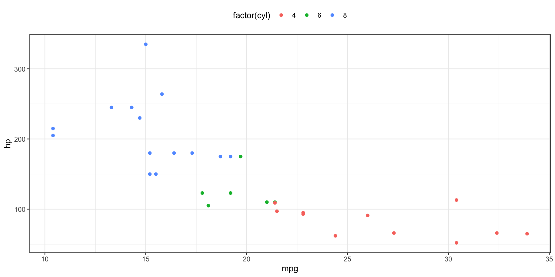
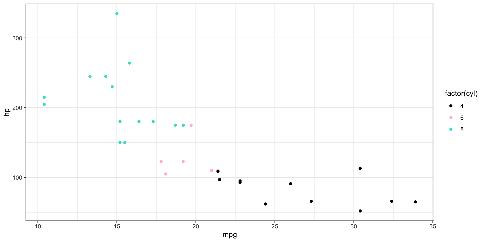
Aesthetics: Colour
- We can visualise more information by colouring the data points by another variable
- For example, in mtcars we can map the number of cylinders to the
colouraesthetic (orcolorif you want to spell it wrong…)

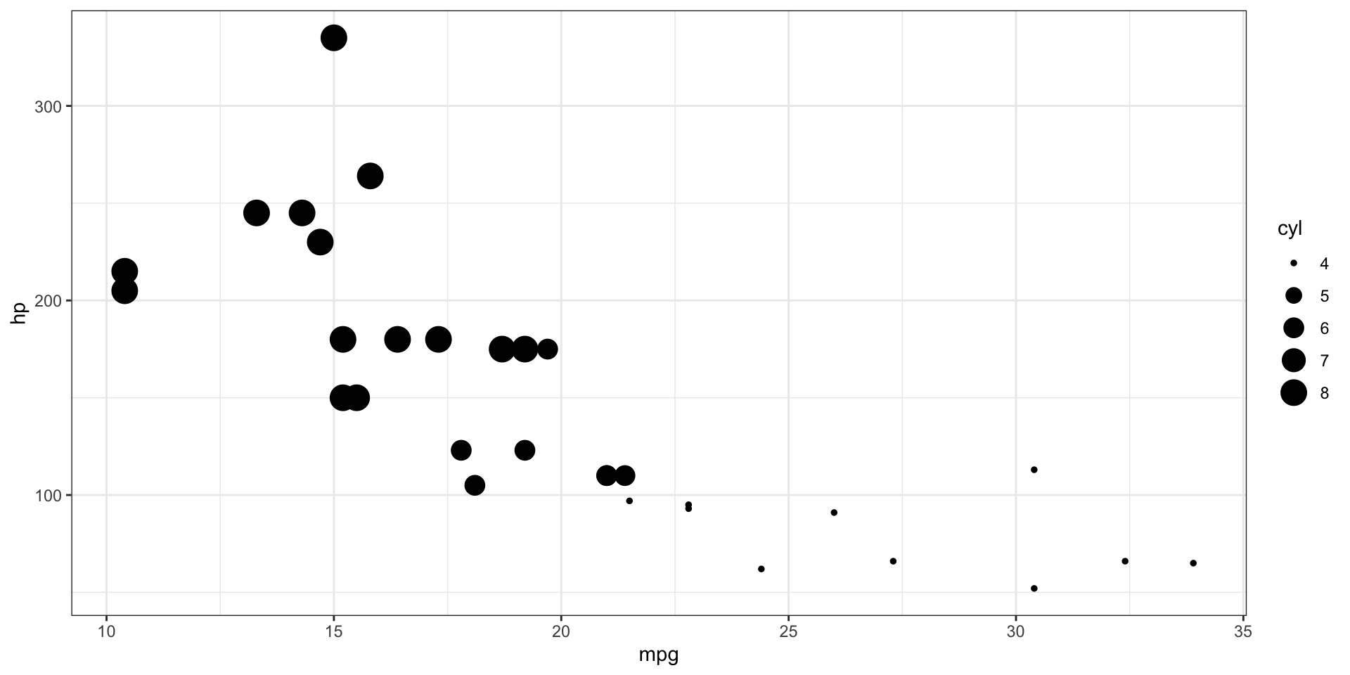
Aesthetics: Size and Shape
- We can also map the number of cylinders to the
sizeorshapeaesthetic
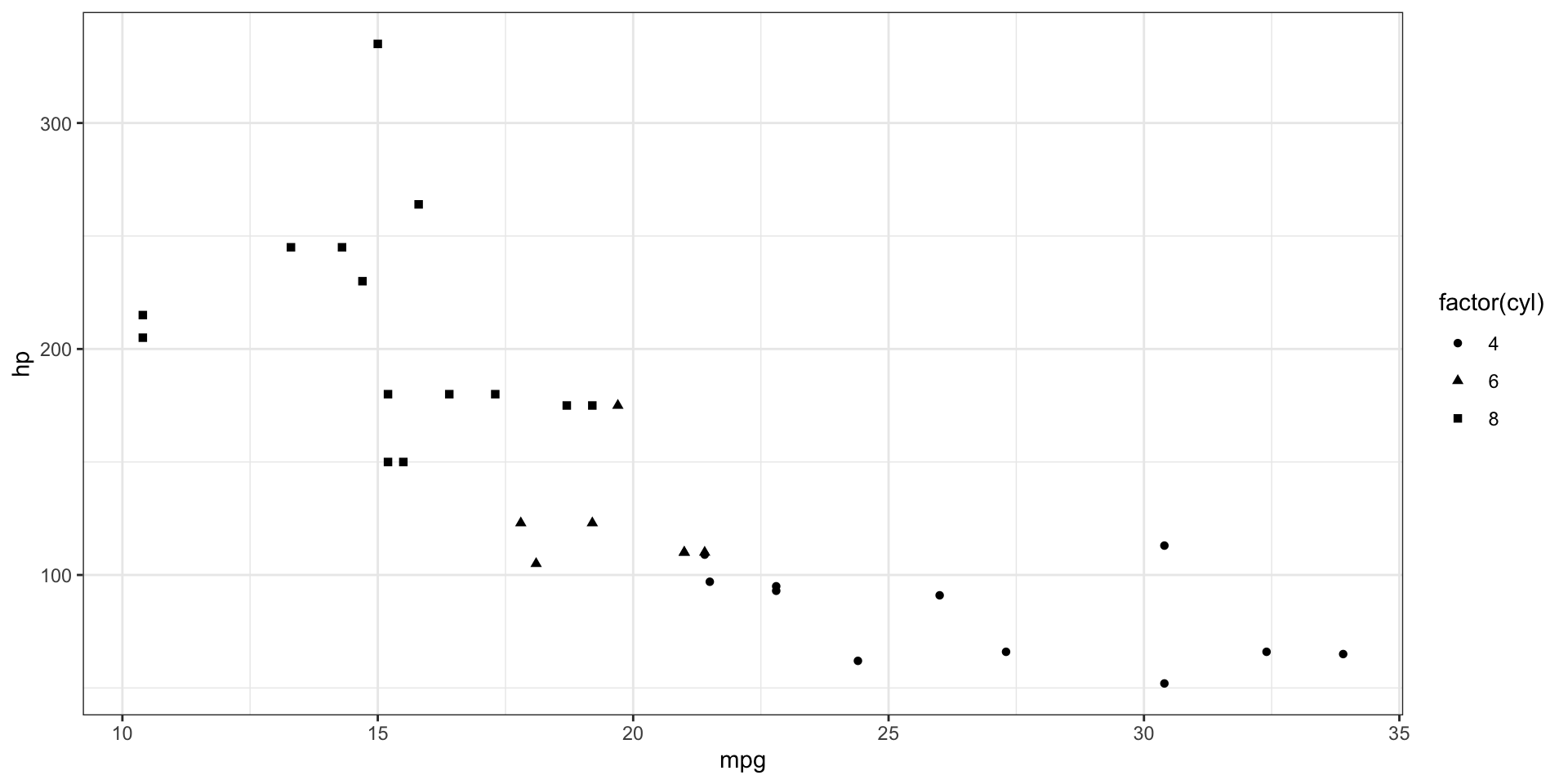
Aesthetics: Shape & Colour
- We can combine aesthetics as we like too!

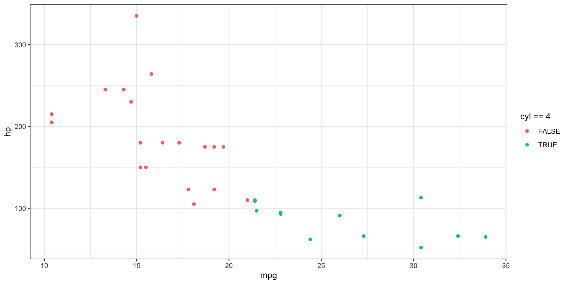
Aesthetics: Conditional Colour
- We can even map an aesthetic to a datapoint based on a condition, i.e. only change colour when a certain condition is met.
- For example here, the colour varies depending on whether the car has 4 cylinders or not (
cyl == 4beingTRUEorFALSE)
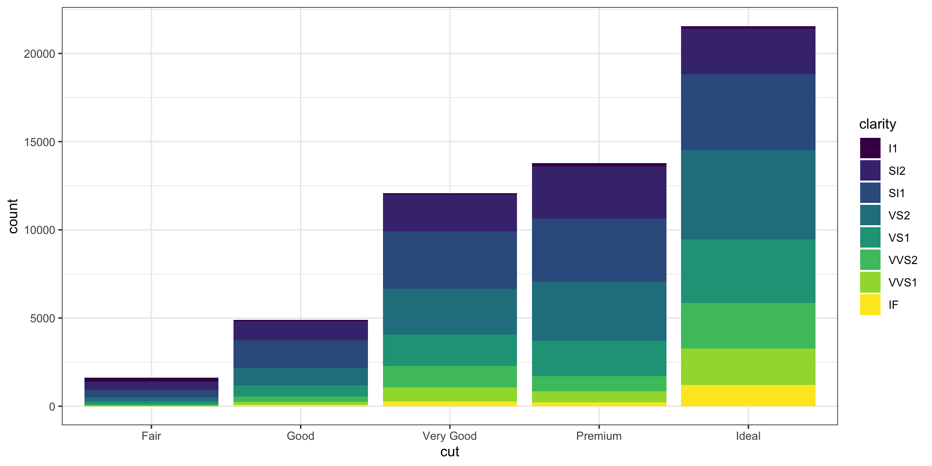
Aesthetics: Fill
- Fill is yet another aesthetic
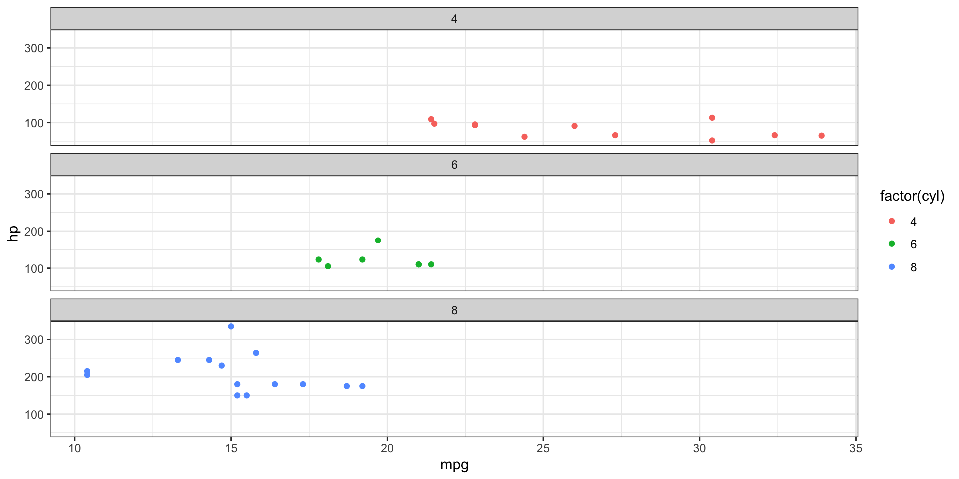
Facets
- A “facet” is one section of something that has many sections.
- A “facet” in ggplot allows you to break up the data into different subsets and plot individual panels based on it
- Creates “subplots” or panel-like figures
- Really useful when you’ve got categorical variables (such as gender)

Facets: layout
- We can change the layout of the “facets” locally:
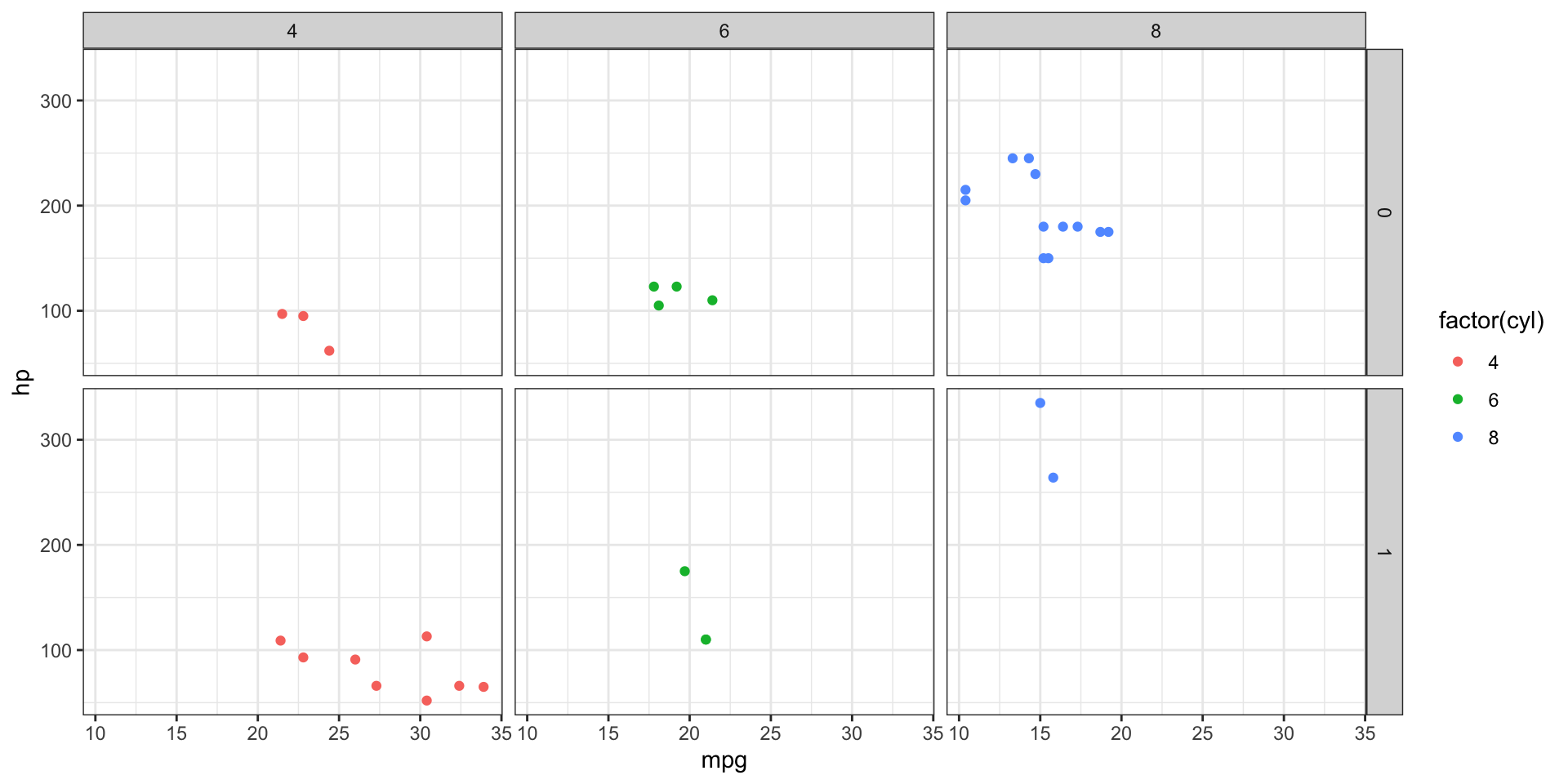
Facet grids
- We can combine 2 variables with
facet_grid()
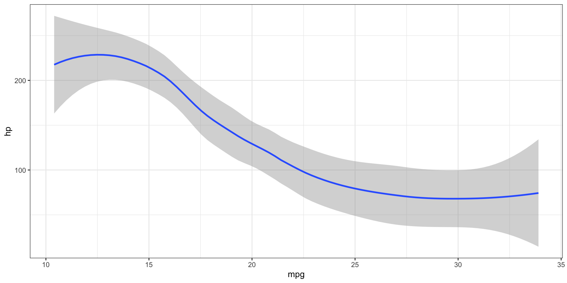
Additional Geoms
- So far we’ve only used
geom_point(), but there are naturally many more geoms we can use geom_smooth()draws a smoothed line based on the trend of the provided data- They can be used individually, or layered on top of one another, which is the core of the grammer of graphics
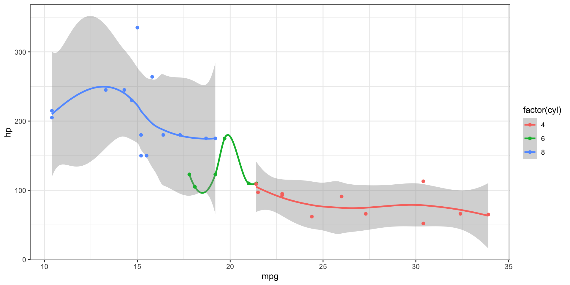
Combining geoms
- Here we layer two geoms

- Note that the order of geoms can matter! (though in this case it doesn’t :P)
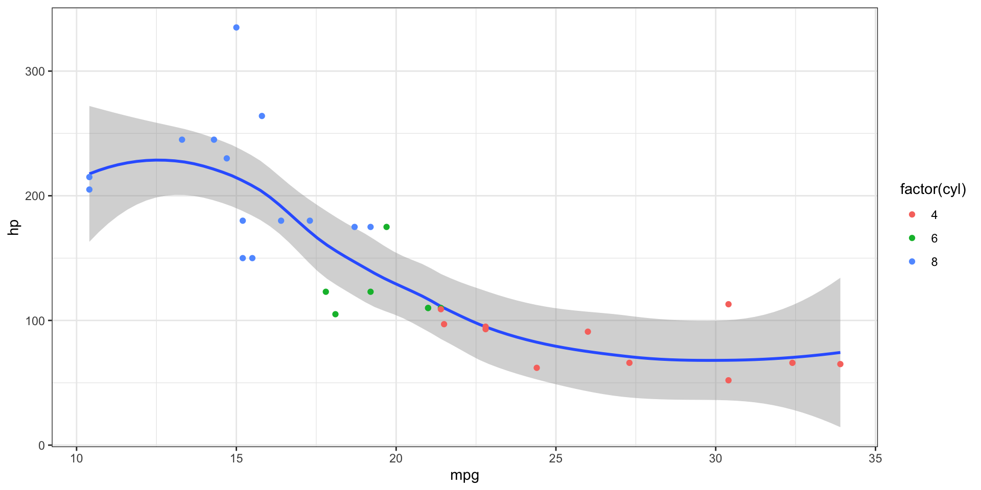
Layering geoms and additional aesthetics
- The order in which we give aesthetics can also matter
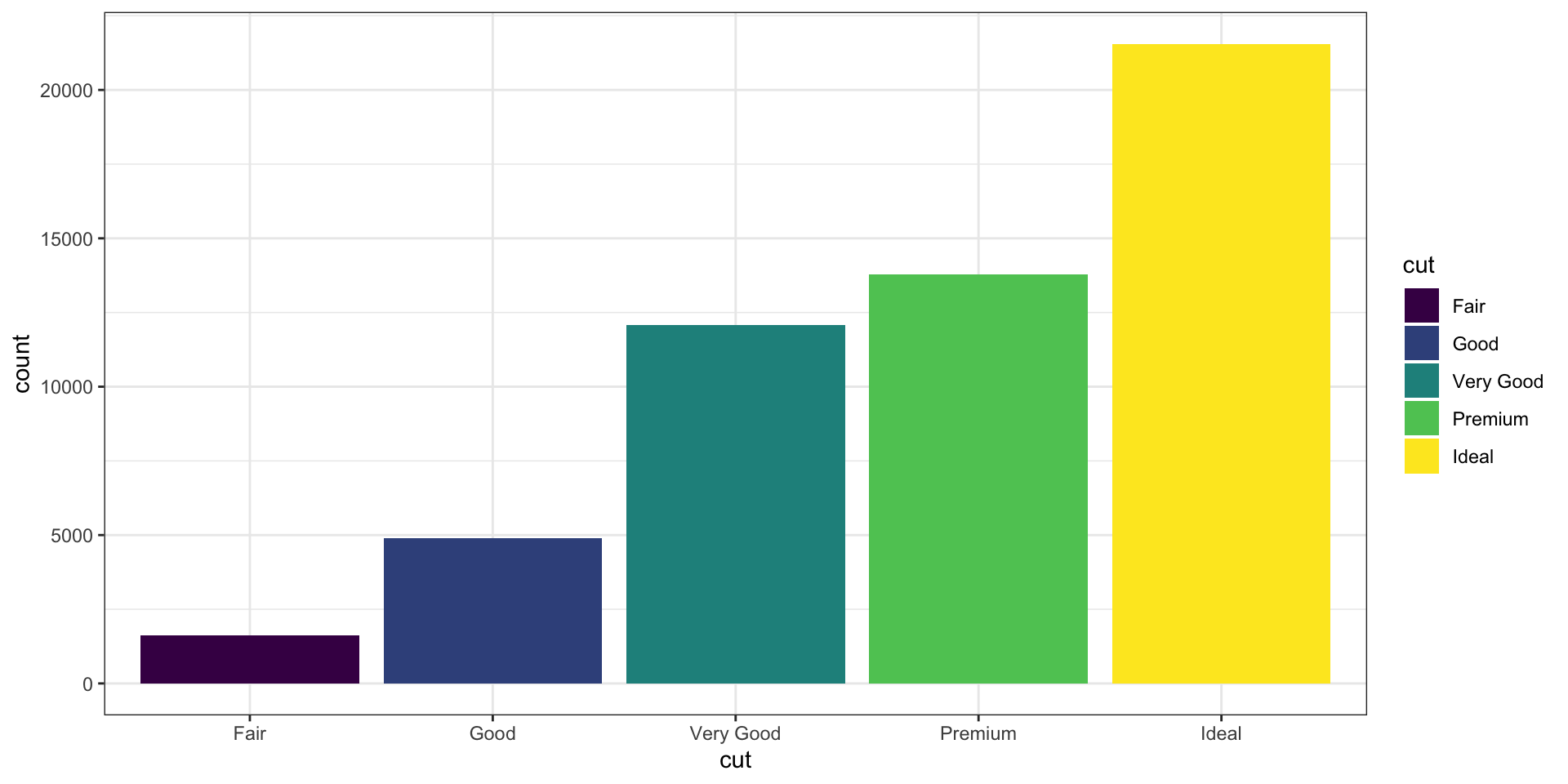
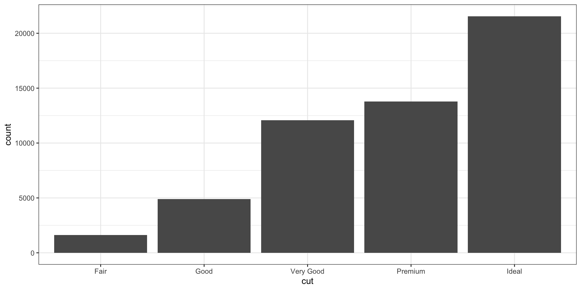
Statistical Transformations: count
- Some plots transform your data internally and plot those new values instead of raw values
- The
statargument of different plot types (geom functions) specifies the statistical transformation - For example,
geom_bar()usesstat = "count"as it’s default to create counts of the mapped variable (as in what a bar chart does):

Statistical Transformations: identity
- Another commonly used stat is “identity” when plotting bars with heights based on raw values

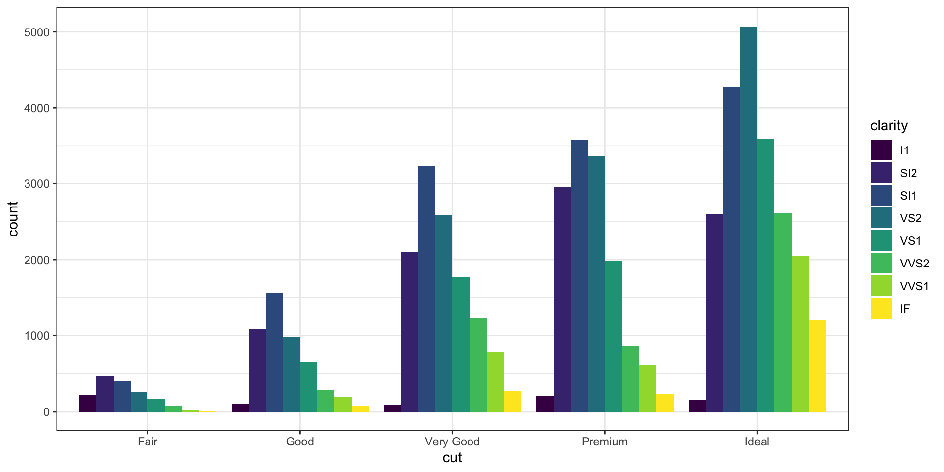
Positional Adjustments
- The
positionargument can control how geoms occupy space
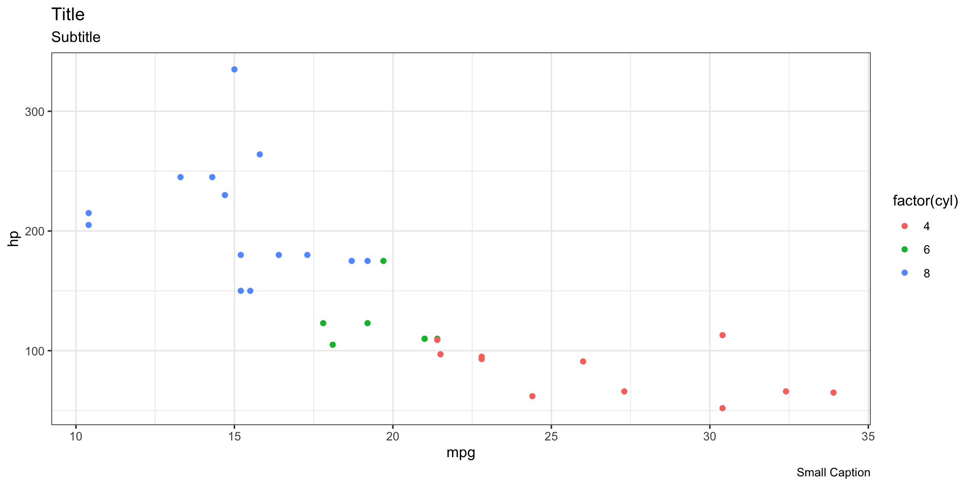
Labels: Titles and Captions
- Another editable part of a plot are the text labels, which we can add or modify using
labs()
Labels: Axis and legends
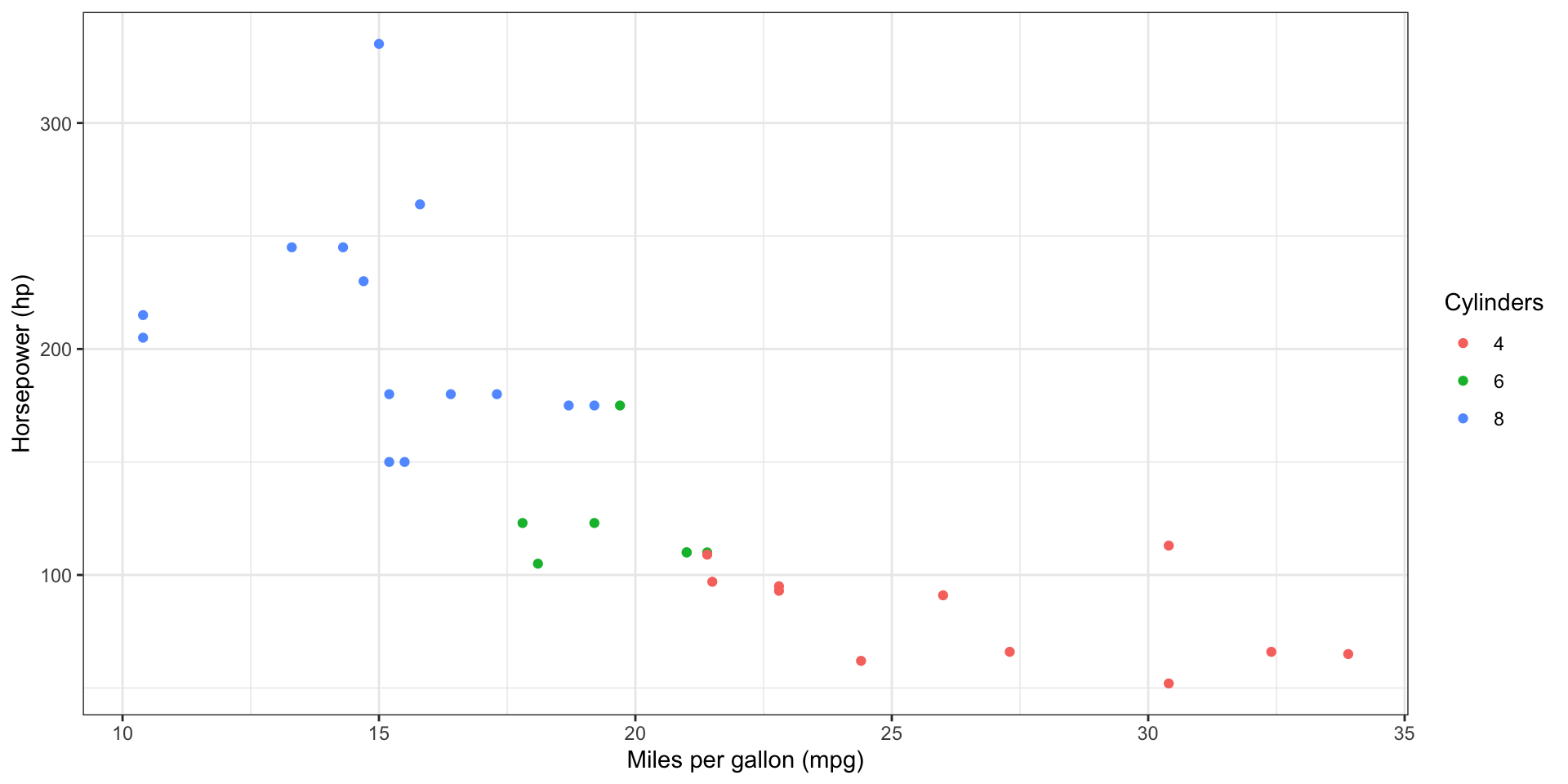
Labels: Axis alternative
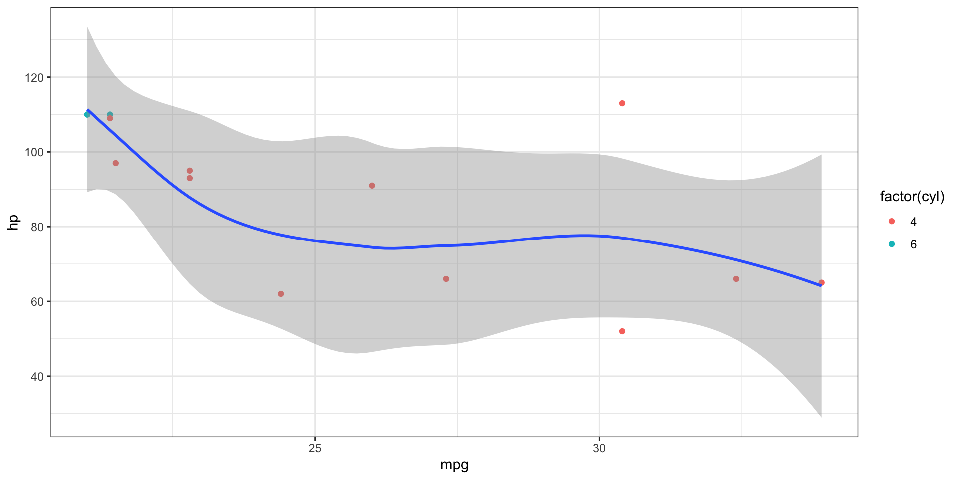
Annotations
- To add annotation to data points, we can use
geom_text()andgeom_label()

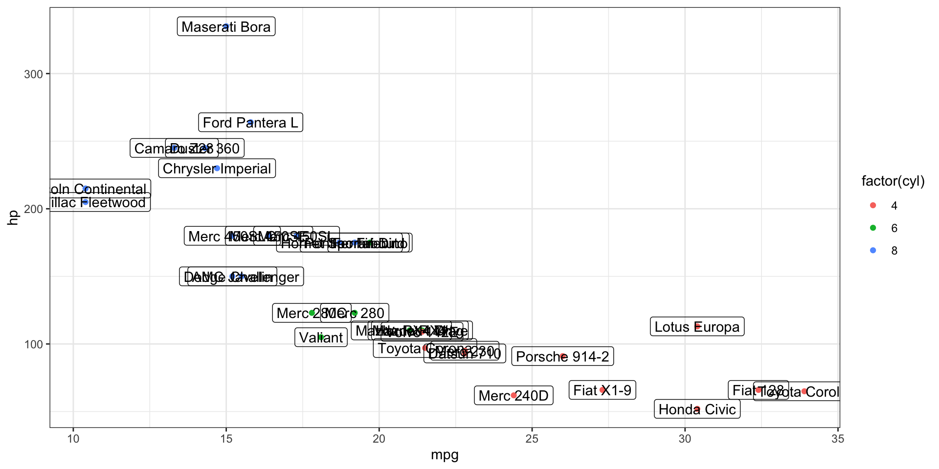
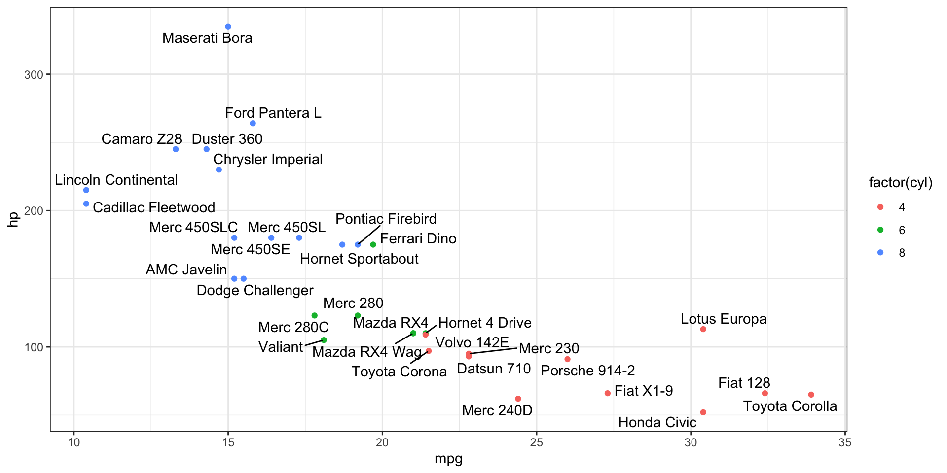
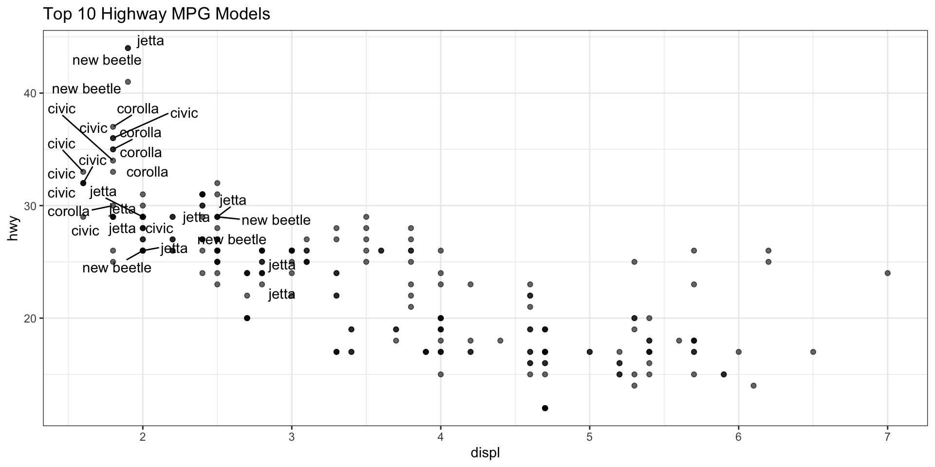
Annotations: ggrepl
- The
ggreplpackage can help make more legible labels
ggplot(data = mtcars, mapping = aes(x = mpg, y = hp)) +
geom_point(aes(color = factor(cyl))) +
ggrepel::geom_text_repel(
aes(
label = rownames(mtcars)
),
max.overlaps = 100
)
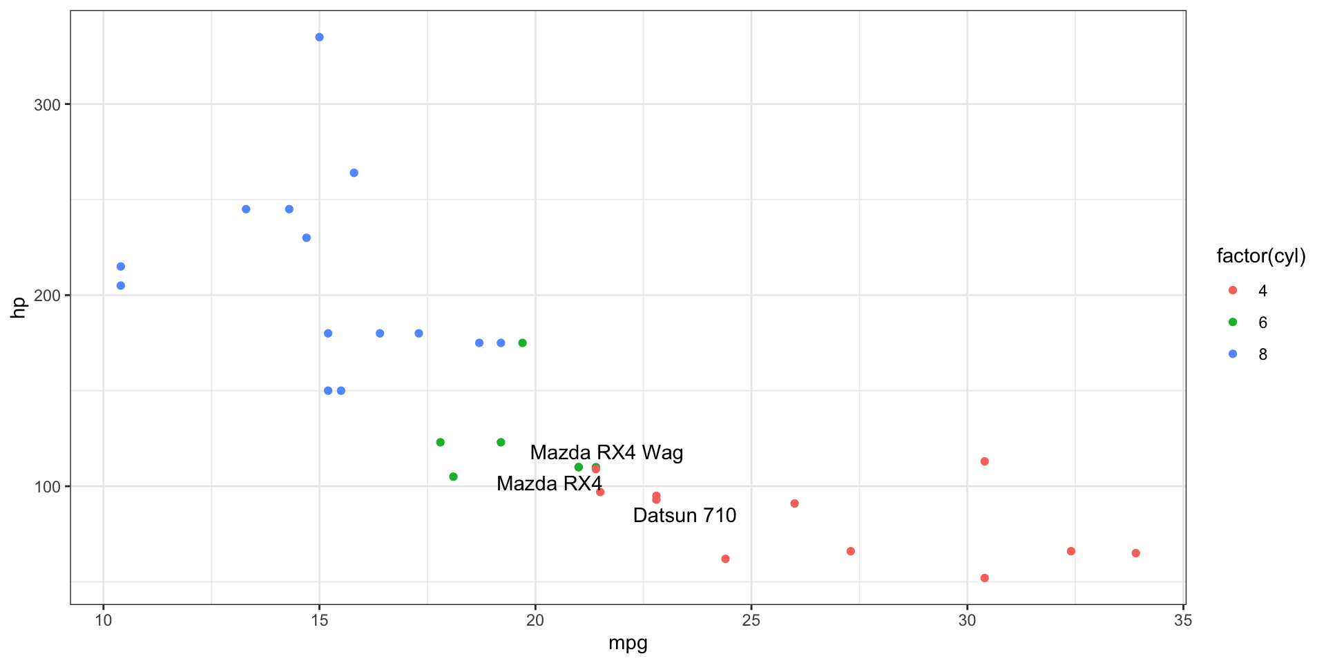
# Label only a subset
ggplot(data = mtcars, mapping = aes(x = mpg, y = hp)) +
geom_point(aes(color = factor(cyl))) +
ggrepel::geom_text_repel(
aes(
label = rownames(mtcars[1:3, ])
),
data = mtcars[1:3, ]
)
More elegant annotations
Zooming
- To control the plot limits, you have 3 methods:
- Adjusting the data that’s plotted
- Setting xlim and ylim in
coord_cartesian()(do this!!) - Setting the limits in each scale
Zooming - coord_cartesian
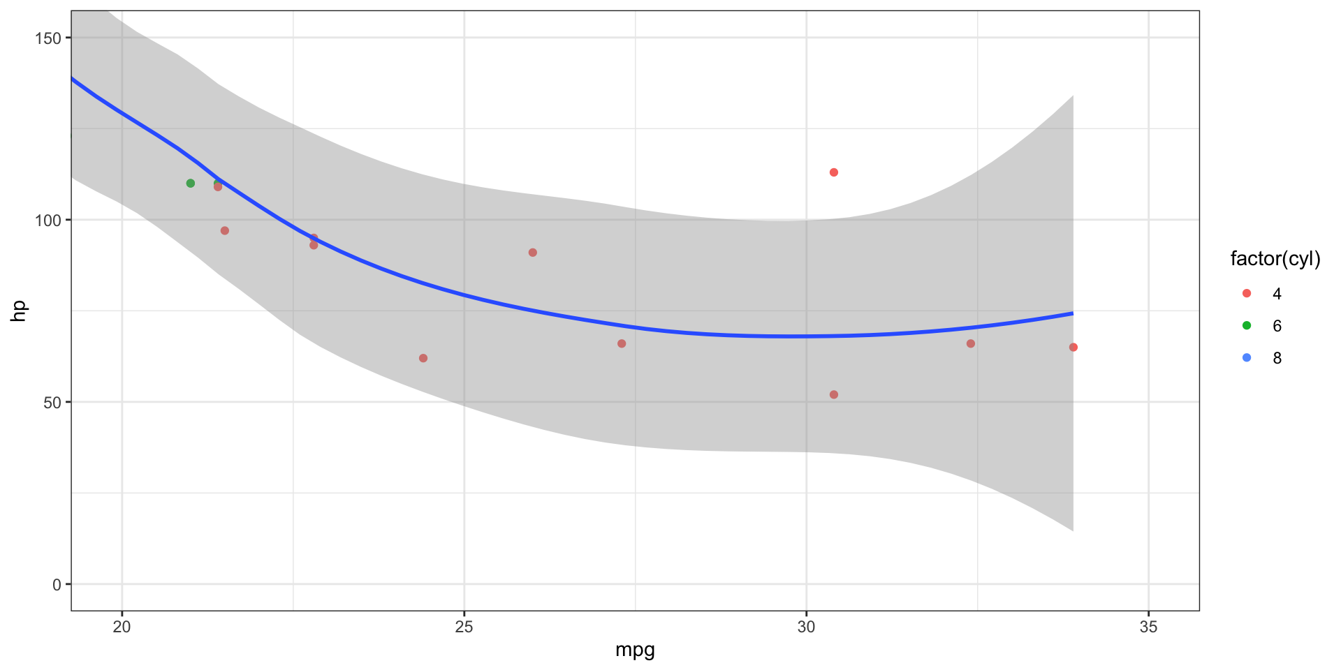
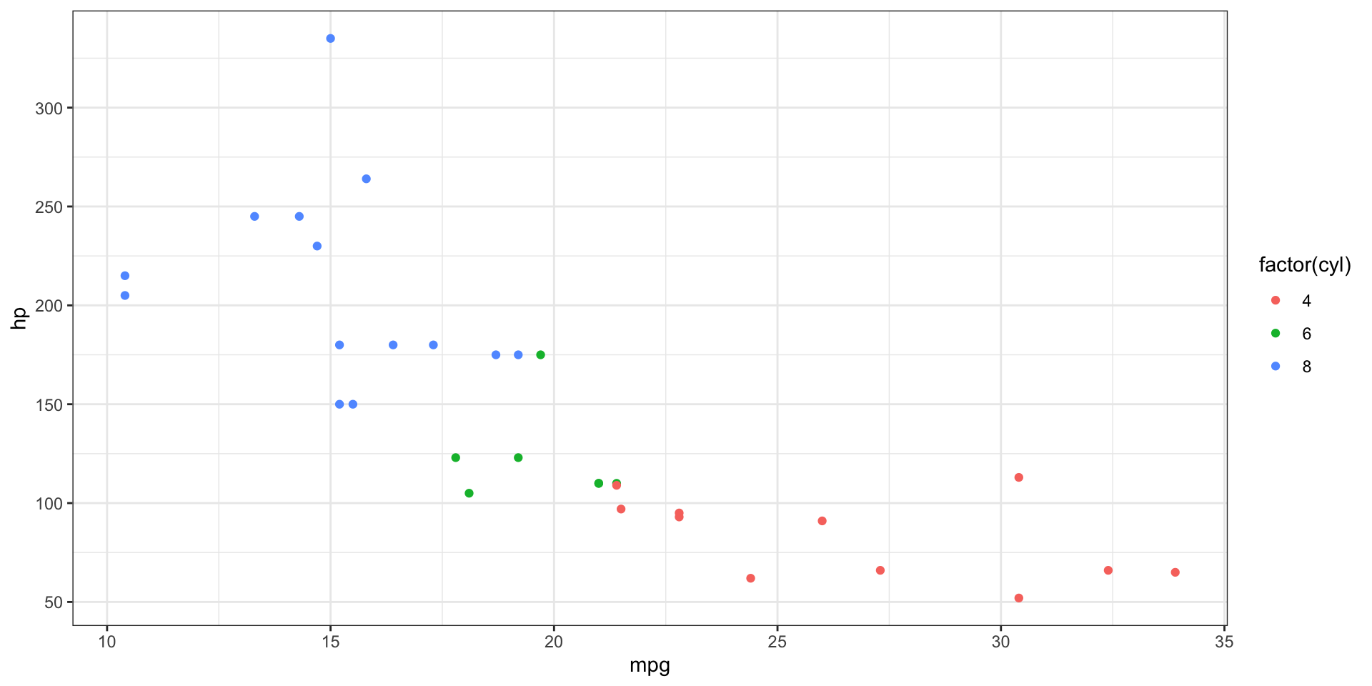
This is the RIGHT WAY, using coord_cartesian()
Zooming - lims
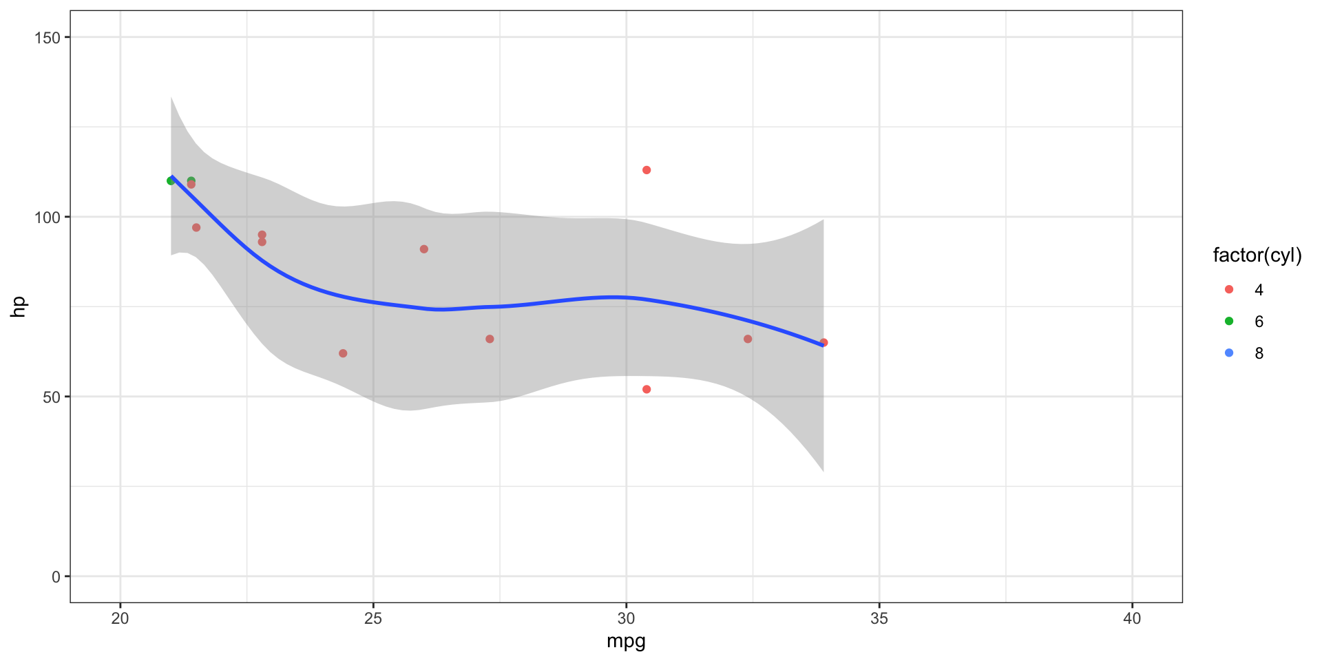
This is also not ideal, as it removes data outside the limits!
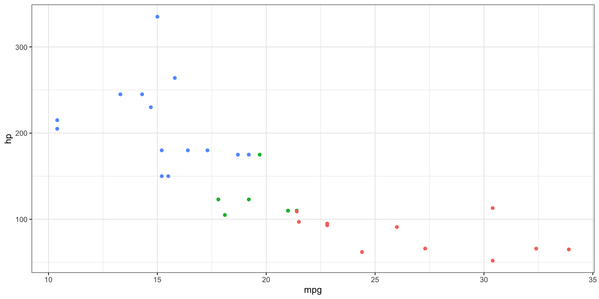
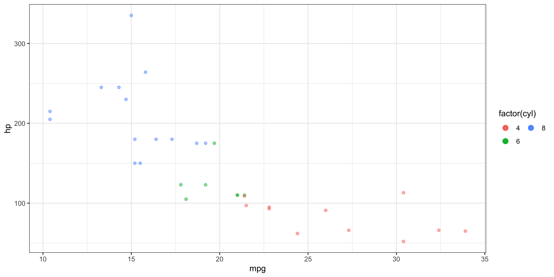
Scales
- “scale” allows you control mapping things like colour, size and shape to data values
- “scale” draws a legend or axes
ggplot2automatically adds default scales behind the scenes

Scales - defaults
- Is the same as:
Scales - axis breaks
- The naming scheme tells you the aesthetic (
x_,y_,colour_, etc) and the name of the scale (continuous,discrete)
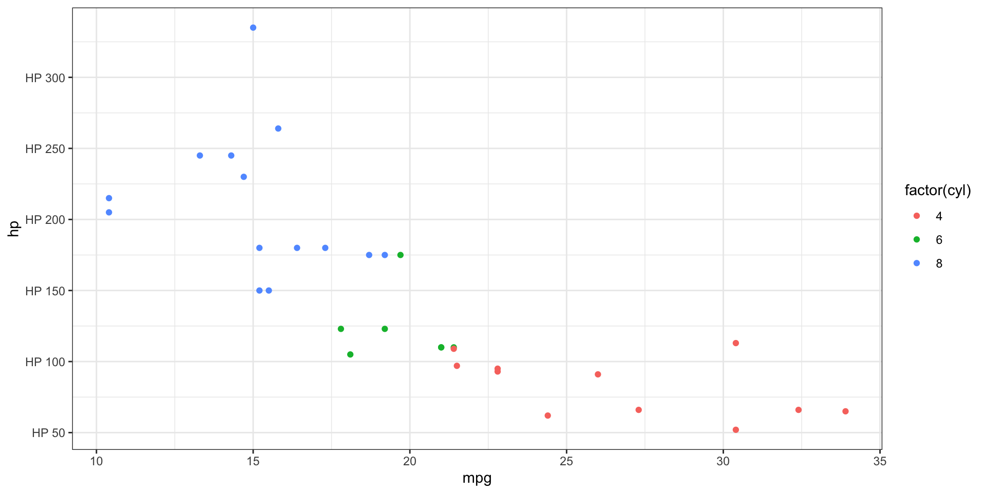
Scales - axis labels
# Adding text to labels
ggplot(mtcars, aes(x = mpg, y = hp)) +
geom_point(aes(color = factor(cyl))) +
scale_y_continuous(
breaks = seq(0, 350, by = 50),
labels = paste0(
"HP ",
seq(0, 350, by = 50)
)
)
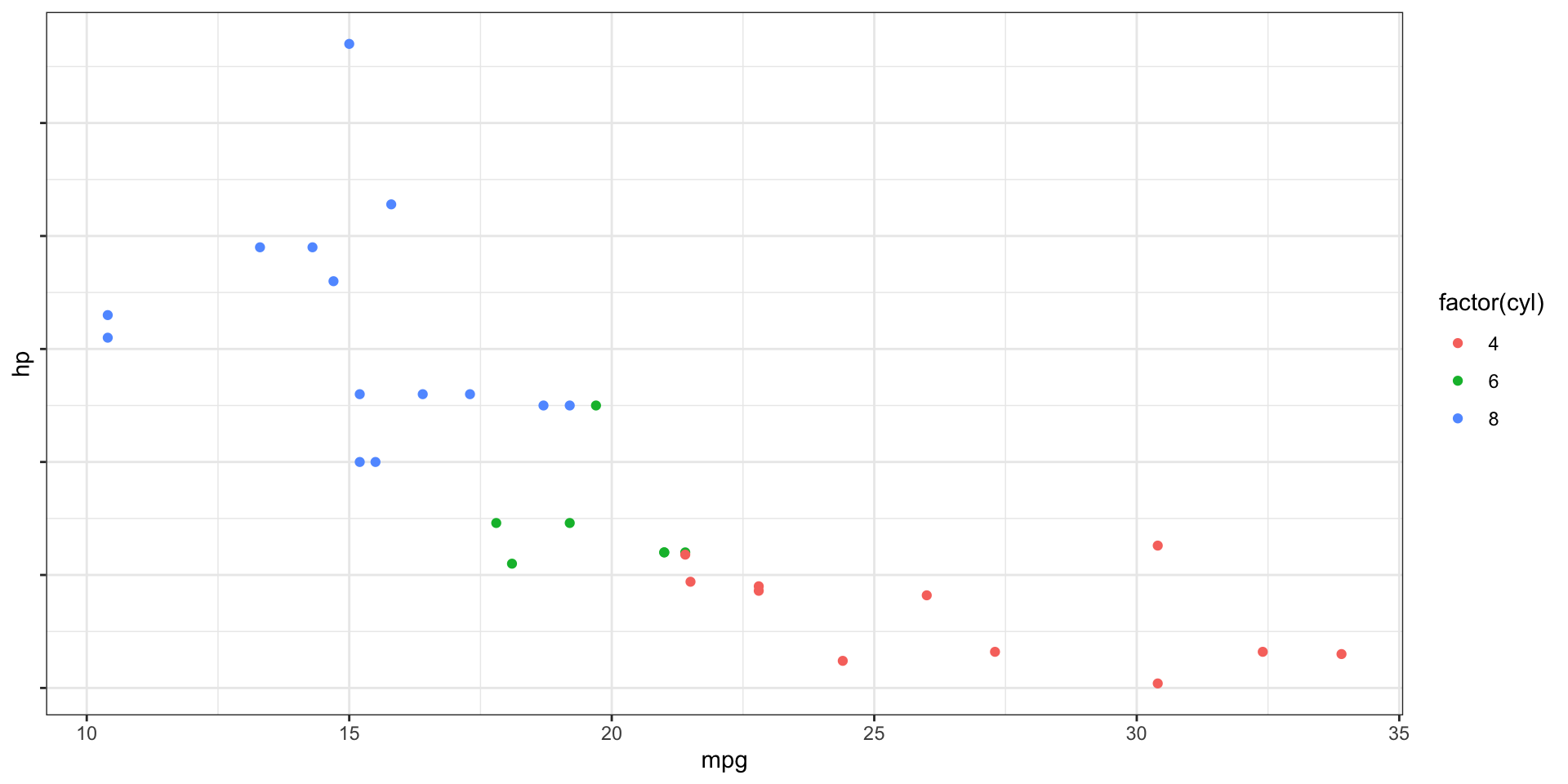
# No labels
ggplot(mtcars, aes(x = mpg, y = hp)) +
geom_point(aes(color = factor(cyl))) +
scale_y_continuous(
breaks = seq(0, 350, by = 50),
labels = NULL
)
Legend Layout - position
- The legend can of course also be modified in lots of ways
Legend Layout - guides
- We can use the
guides()function to control the legend display
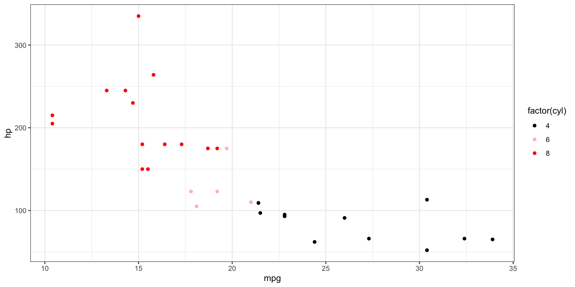
Controlling the Colour Scale - alt palettes
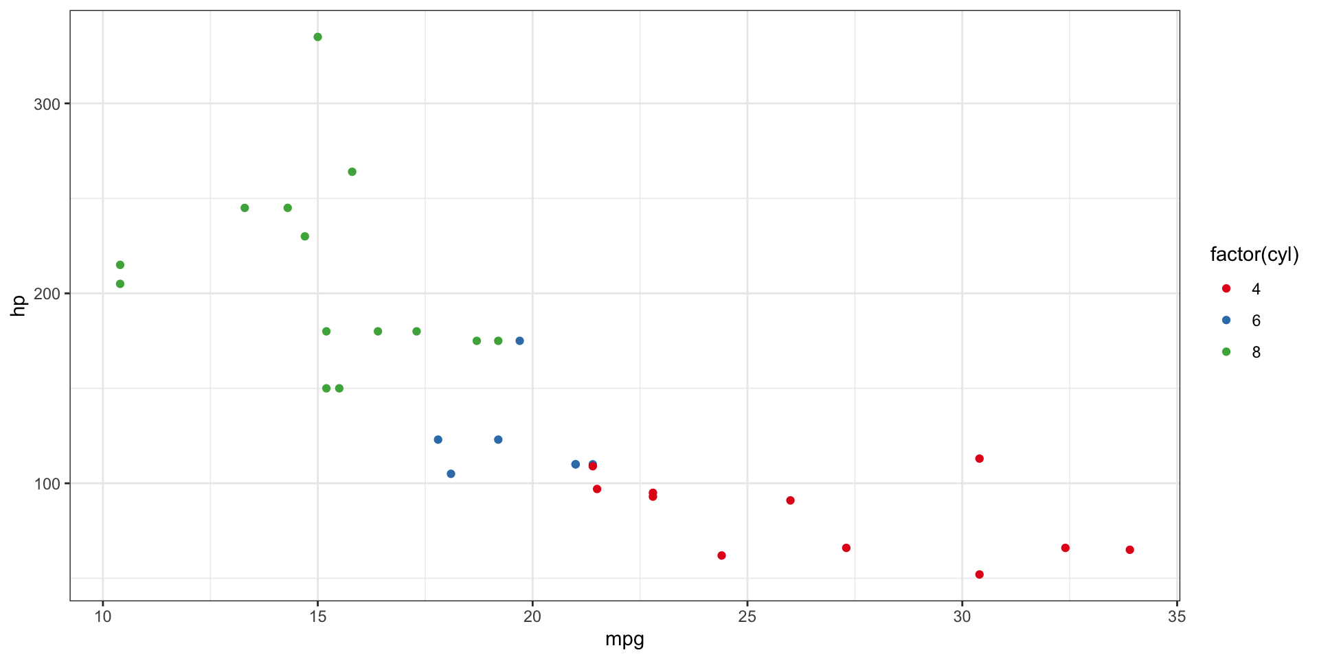
Controlling the Colour Scale - manually
ggplot(mtcars, aes(x = mpg, y = hp)) +
  geom_point(aes(color = factor(cyl))) +
  scale_colour_manual(values = c("black", "pink", "turquoise"))

# Explicitly setting the values to colours
ggplot(mtcars, aes(x = mpg, y = hp)) +
  geom_point(aes(color = factor(cyl))) +
  scale_colour_manual(
    values = c(
      `4` = "black",
      `6` = "pink",
      `8` = "red"
    )
  )
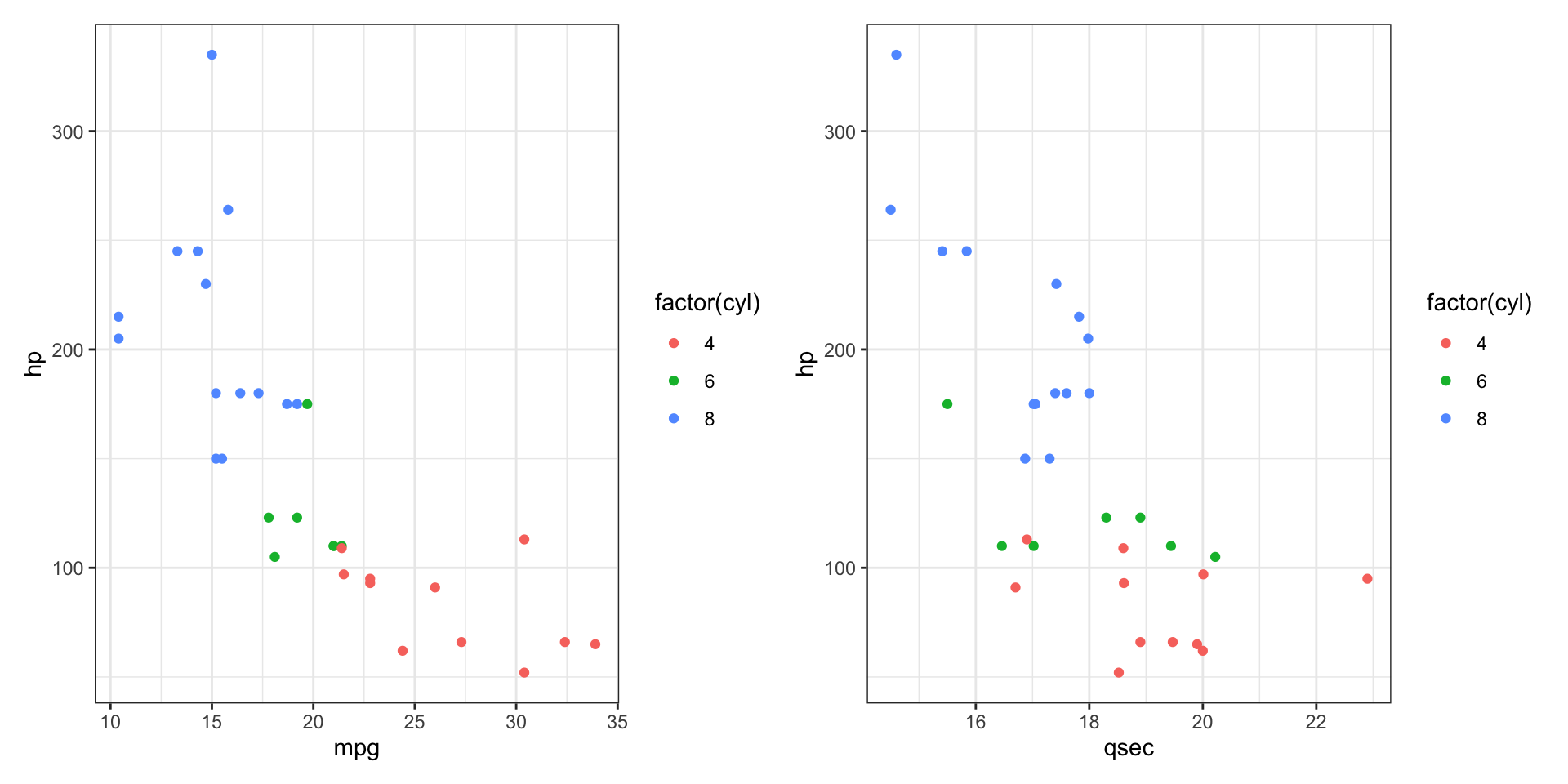
Compound plots
- What if you want to put two or more plots together to save?
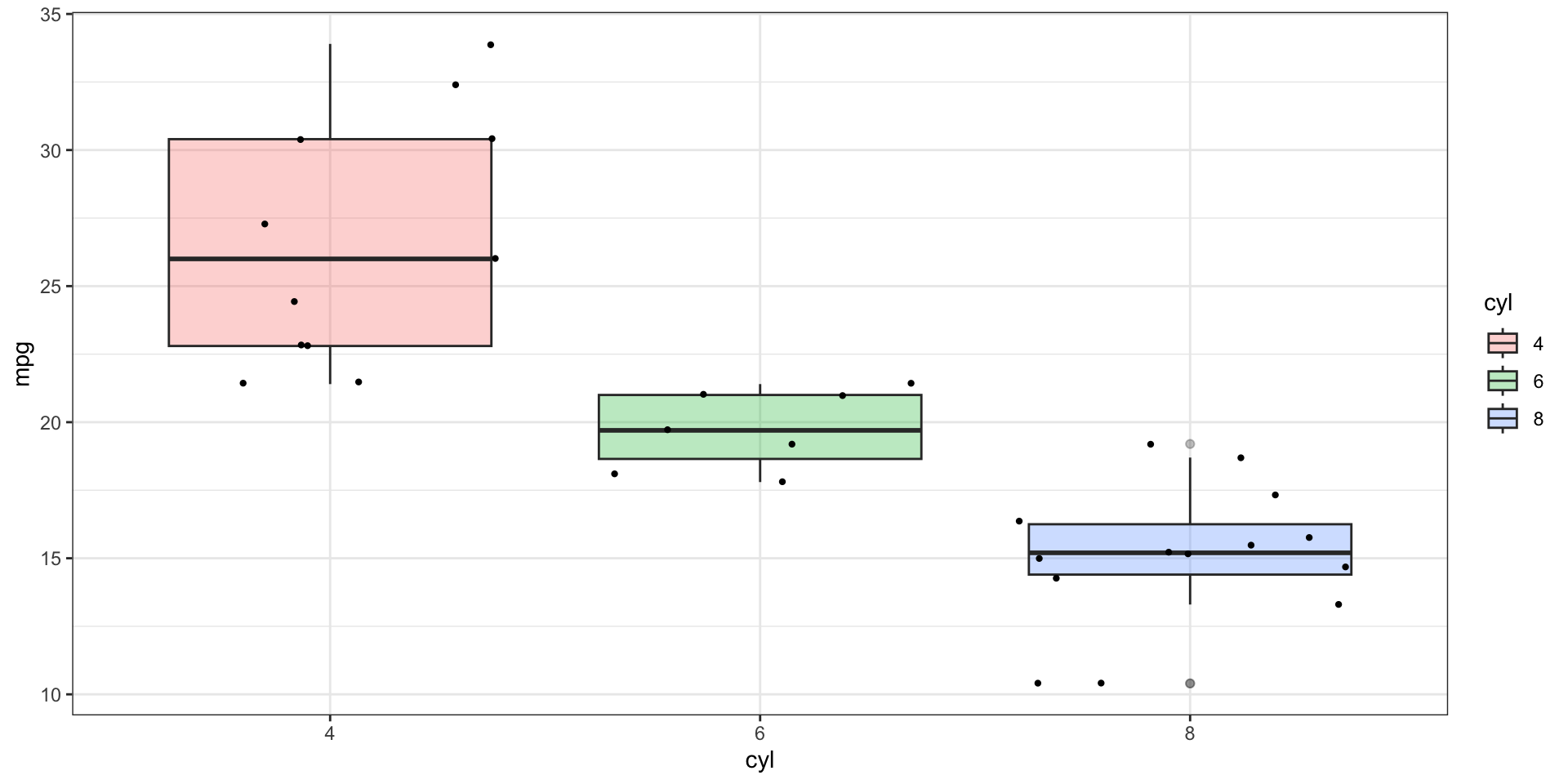
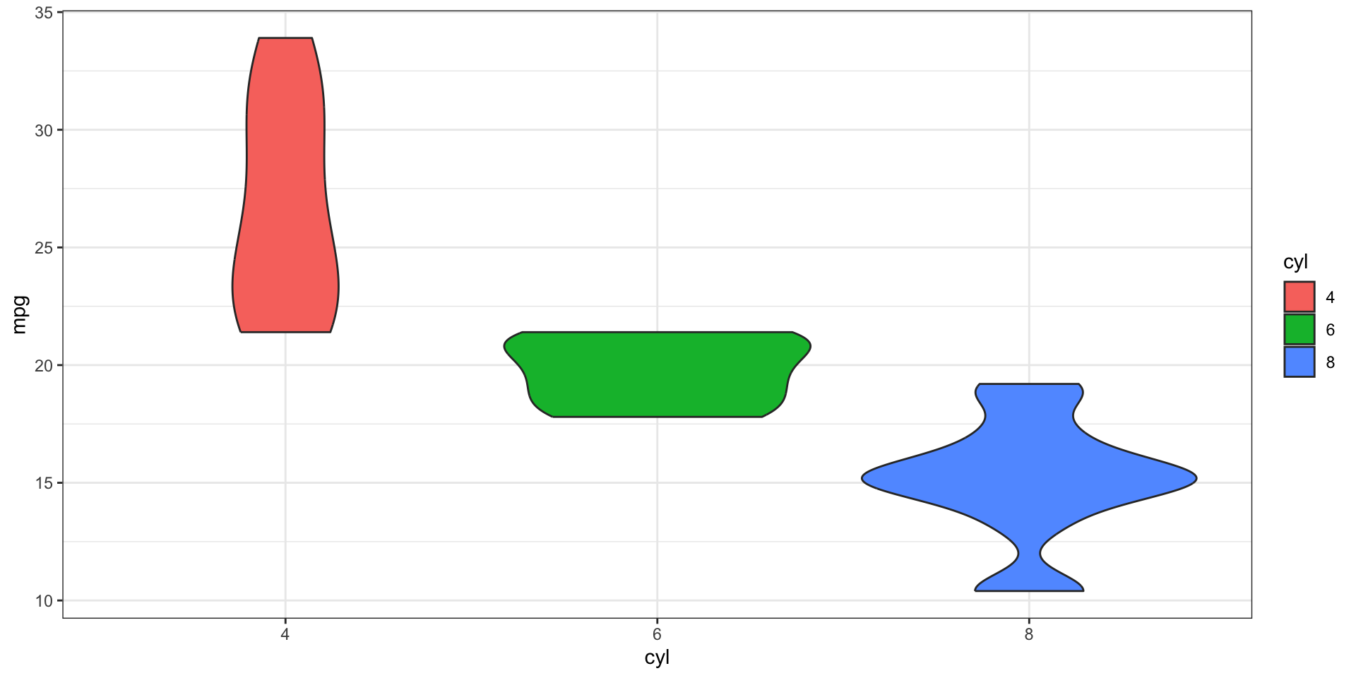
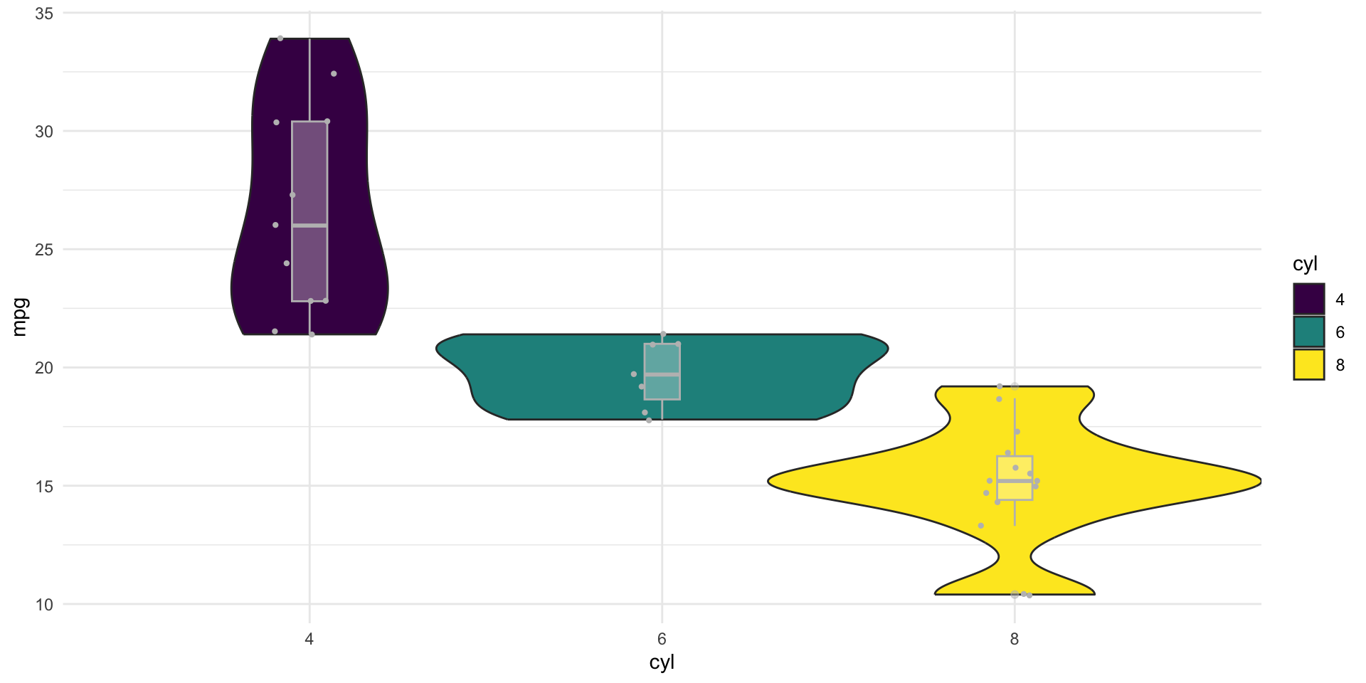
Boxplots and Violin Plots
- Boxplots and Violin Plots are very common within biolosciences(protein levels, patient data, SNP frequency etc.)
- Be warned that boxplots can sometimes be misleading and so it’s always good to check the raw data too! See here for more info
- Have a go at creating your own boxplots and violin plots using the mtcars/diamonds/other datasets!
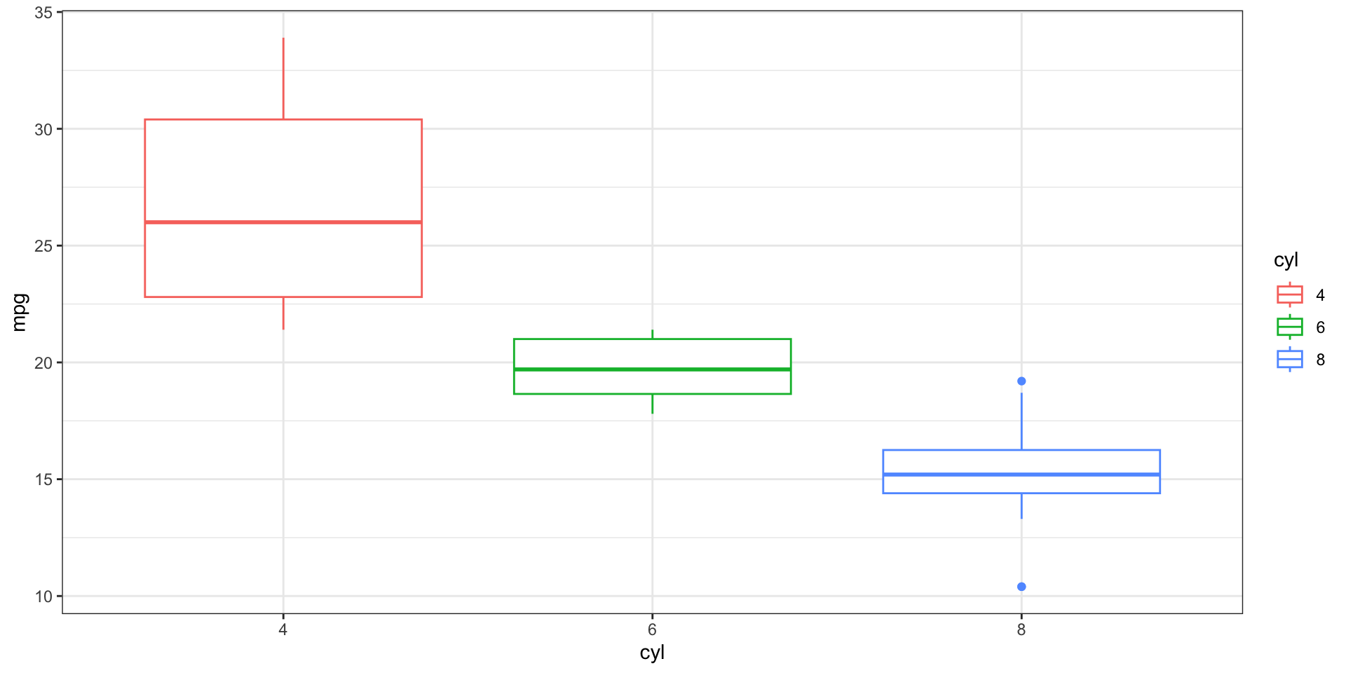
Boxplots and Violin Plots - examples
geom_jitteris likegeom_point, but adds noise so point aren’t on top of each other, handy for mapping the raw data onto other geoms!
Boxplots and Violin Plots - combining geoms
- We can of course layer them on top too!
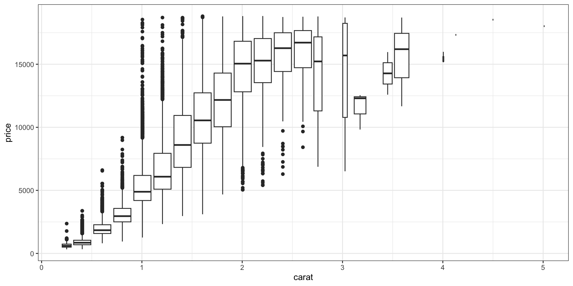
Boxplots and Violin Plots - numeric to categorical

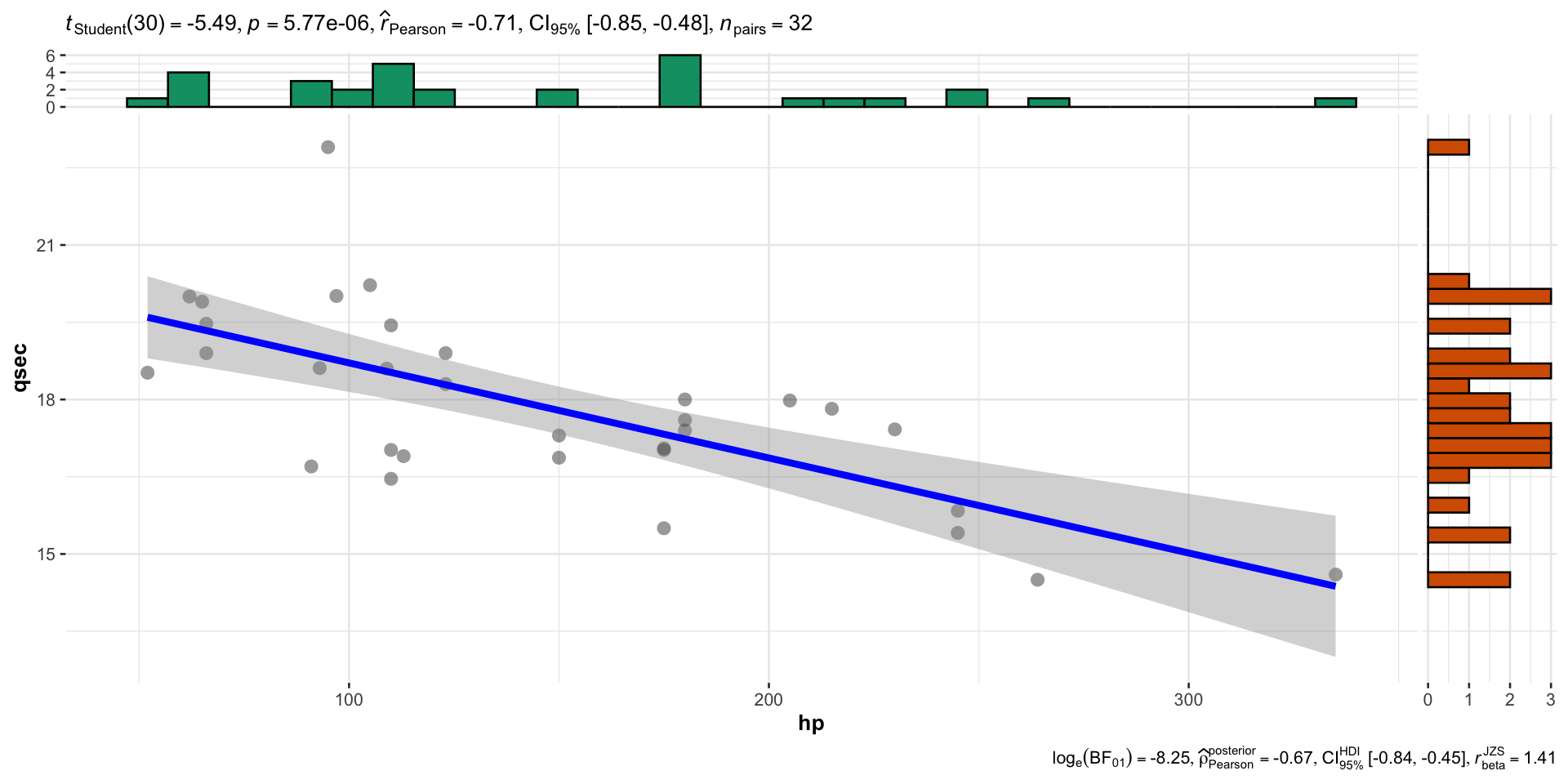
ggstatsplot
- A handy way to quickly look at correlations!
That’s all folks!
- These slides can be found on the website here: